Drawing a Sacai with Nicolet

Welcome 👋 I’m Nicolet and I’d like to share my drawing process with you today.
Before I dig into it, let me tell you a little about myself. I studied illustration and printmaking at MICA in Baltimore. I made it a point to stay off the computer and develop my traditional media skills while I had all the facilities and resources of art school at my fingertips. I knew I’d have plenty of time in the digital space outside school, and sure enough, I have since transitioned to a career in digital product design. During the day, you’ll find me advocating for beautiful basics and delightful interactions at Nike’s digital innovation studio, s23NYC. In the evenings, I’m curled up on the couch, usually with Star Trek playing in the background, drawing on my iPad.
In my illustration work, I find interest in the little things. I focus in on objects and moments of stillness as portraits of grand concepts and moods. I’m highly influenced by magical realism and the act of assigning greater meaning to the most minute details. Heaviness through lightness, if you get my drift.
Today, however, I’d like to take you through my drawing process with a subject that has no greater meaning, that ties into the aesthetics of my day job. Let’s draw a Nike Sacai.
But first, I invite you to join me. I’ve included a coloring book of 3 original drawings for you to color and shade. Since I’m providing the line work, Steps 1-4 are done, and you’ll jump in at Step 5 to finish them off.
What you’ll need to draw:
My drawing book [ Download ]
Digital drawing app of choice + stylus pen
I’ll be using Procreate on the iPad with Apple Pencil, but you can use anything.
Other recommended apps include: Adobe Sketch (iPad), Adobe Photoshop (desktop)
Color inspiration! I encourage you to choose different colors than the ones I chose.
1-5 hours, depending on how detailed you get
*Optional* Sharing platform—Tag me in any posts you make, I’d love to see what you’ve created (IG / Twitter)
~ OR ~
My drawing book [ Download ]
A printer
Crayons / Colored Pencils / Markers / Finger Paint
Set Up Directions
Open/Import a page of the drawing book in your desired drawing app
Set the image layer to a blend mode of Multiply (this makes the white background transparent)
Keep the image layer on top, add any color layers BELOW the coloring book page layer
Lock the layer
Add color layers and keep them below the coloring book page layer (so you don’t cover the lines)
Step 1 — Subject and Planning
I always start a drawing with a subject. Sometimes there is a concept I want to portray, and I choose objects based on that concept. Other times there is an object I want to draw, and I start considering how that object can expand into a concept.
Today, I chose to draw a Nike sneaker. No more, no less.
I’m looking forward to this upcoming Sacai collaboration. Sacai is a Japanese luxury brand, founded by Chitose Abe. She works to deconstruct and combine formal wear with casual wear, layering and breaking down and reconstructing pieces into a new whole. Look her up!
So, subject chosen! First step, get a reference photo.

Next, I start to understand the visual motifs and why I’m attracted to this object. The colors! They feel really sandy and earthy to me. The layering reminds me a bit of rocks and erosion, movement in landscape. Let’s throw in some sand.

Sand leads me down an internet hole. I start seeing colors, shapes, objects within that Pinterest sand search that match the Sacai vibe. In this image, the geometry of the box disrupting the organic shapes of sand feels a lot like the layering in the sneaker’s sole. The blue pole in this photo reminds me of the purple swoosh in the shoe, maybe it’s something I’ll use as well.

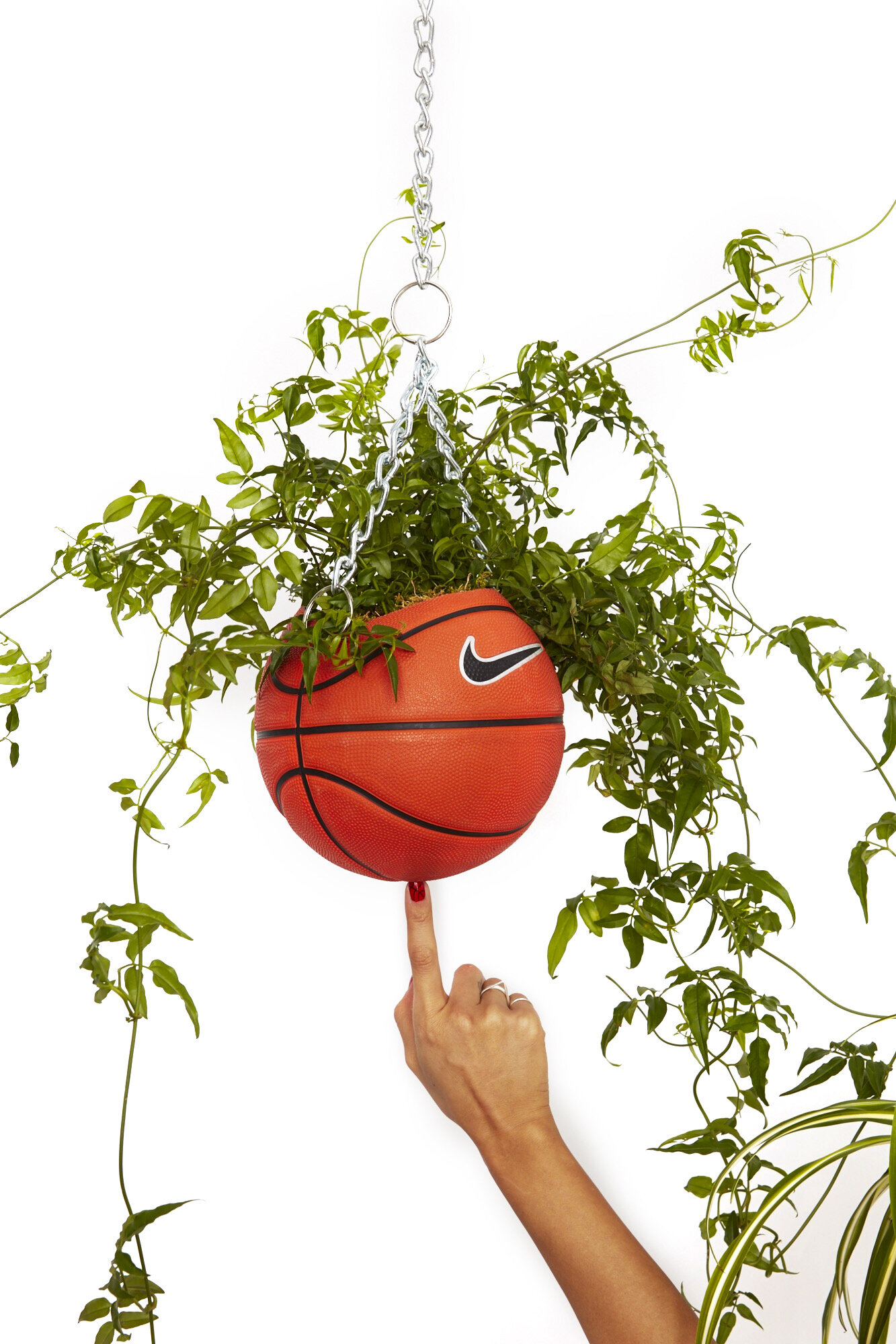
I like putting plants in my drawings. The subtle symbolism of flora speaks to me, and the way plants add luxury to any scene really attracts me. So, a Nike drawing calls for a trendy Nike plant. I remembered the work of Olivia Rose, aka Bodega Rose, and her collaboration with Nike’s Soho store. Let’s put in her Nike basketball planter.
Of course, how the sneaker sits within the space is an important piece. I looked around for inspiration of how shoes have been photographed, how they have been set in space. This looks good and fits really beautifully with the box idea I had already planned.

Ok, I’m ready to start.
Step 2 — Composition
The second step is composing the drawing. Already, I have a mental picture of how all the references fit together, but now I have to translate that to reality.
I use a really thick brush at this point, so I don’t get caught up in details. I need to see the big picture here to balance the objects within the space.
I want the shoe poised on two boxes in the center, so I start there. Since sand can take any shape for the benefit of the composition, I throw in some organic lines to signify its edges. I want the pole on the left, the basketball planter in the top right. How do the vines dangle? The bottom left is feeling empty, what can I add? A vase, why not. Some nourishment in an otherwise dry scene.
Resize, shift around, crop. Feels good! Everything has its place.

Step 3 — Details
Next, I get into the details. In this step, I work on the lines and shapes that define each object. I do not want to feel attached to any mark that goes down. I’m starting to discover how everything will ultimately look.
To do this, I choose a finer brush than before, but still relatively thick and forgiving. I turn the opacity of the composition sketch down very low, and start drawing on a new layer on top of it. This keeps the composition plan in mind, but allows me to explore the details.
At this stage, I do a lot of erasing and restarting. I refrain from allowing strokes to feel precious. I will draw the same element dozens of times if I need to before I get the one that works.
You’ll notice, in this case, I started drawing the Sacai by hand, but ended up opting to trace the reference. I realized the success of the image depended on perfect proportions. Rather than spending the time to get there, I took a shortcut. Don’t be afraid to take shortcuts when you need them! I fully believe in using your tools to create the best result, and one thing about drawing digitally is the ability to pull in images for guidance.

Step 4 — Final Line Work
Now that everything is fully formed, it’s time to be precious. It’s time to give the lines the attention and the love they deserve.
I choose the brush and brush size that suits my drawing quality, which for me is often a fine HB pencil. I like the texture it maintains and the softness it brings to each edge. I turn down the opacity of the detail sketch, and I get to tracing again.
This part can sometimes feel tedious, and pretty repetitive since you essentially did the same thing just a moment ago. However, I find this to be the most important step in the process. Everything starts to make sense. If there was an element in the last step that didn’t feel quite right, here I finally discover it. You can see this happen in the vase. Notice how the top of the vase changed from Step 2 to Step 3 to Step 4. You can also see the handle become more intentional and the sand dune move to the right.
These lines will remain visible on the finished piece. Once the quality and amount of detail feels right, I’m ready to move on.

Step 5 — Color Blocking
For anyone who downloaded the coloring book, this is where you come in!
Choosing color is its own art form. A good piece maintains color harmony across the entire canvas. I recommend reading up on color theory and taking a look at other artists’ palettes that speak to you.
But, let’s talk about how I do it. I often imagine color before I start applying it. While collecting references, I’m visualizing color themes, and while drawing lines, I’m imagining what colors will go where. It’s a process in marination. I tend to stick to a palette of 3-5 colors. A limit helps maintain harmony and provide balance. I can add to it with intention later, if I need to.
For this drawing, since I want to stay true to the Sacai’s colorway, I have my palette defined. I have four colors—green, pale purple, maroon, and tan—plus black and white.
First, the brush. I use a large textural brush to fill in color, and I try to maintain that texture while applying it. To do that, I let the brush naturally expand outside the lines, and erase the edges back down. In Procreate, I like the Soft Pastel brush for this stage.
So, let’s get to it. Purple swoosh, purple background. From the beginning, that color spoke to me as a great backdrop, so I start there, filling in the whole canvas. Next, let’s block in the shoe, since that’s defined for me. At this moment I find the shades of green, maroon, and tan that compliment the pale purple.
Now that my base is created, I can apply the colors across the board. The sand obviously needs to be tan, the boxes are white, the vase is maroon. I want the basketball and the pole the same color, but what color isn’t sure to me yet. I test out different variations until I land on a minty version of that green. The vines will probably need a second tan that expands the palette slightly. Maybe it can match the shadow under the shoe.
I always create one layer for each color. All the maroon is on one layer in Procreate. All the dark green is on another layer, all the mint is on another, all the tan, etc. This way I can alter and shift and change, using clipping masks to test different colors using one quick color fill, until the image has a color balance that feels right.

Step 6 — Shading and Highlights
This brings us to our last step—shading and highlights.
Choose a light source. Which direction do you want light to hit? Hold that in your mind as you shade. For this drawing, I chose upper right. Since the shoe is facing in that direction, it would hit the top of the shoe perfectly.
And, have at it! Really, the best advice for shading I can give is test and erase and play with it. If your line drawing is solid, the shading should be pretty free form and expressive. Follow the light source. Ask yourself, if that light source hits this object, where would the darkness be? Where would the highlights appear?
Play with your brushes. Have fun with textures. In this drawing, I discovered a dot brush captured the texture of a basketball beautifully. I then carried it to the shoe for material, and to the sand for grain. Use sharp brushes to make stylistic, shapely shadows, use soft brushes for more three dimensional effects.
I also change line color at this point. Pure black lines are usually too stark with my drawings, so I erase them or change their colors to amplify shading and further define elements. You won’t be able to do this with the coloring book, but note this for any drawings of your own.

Finished!
With that, your drawing of a Sacai is complete. Thank you for tuning in. I hope this guide is helpful and inspires you. If you followed along, please share your drawings with me and DM me with any questions. I’d truly love to hear from you.
Happy coloring,
Nicolet
Text & Illustration by Nicolet Schenck