Faire Projects
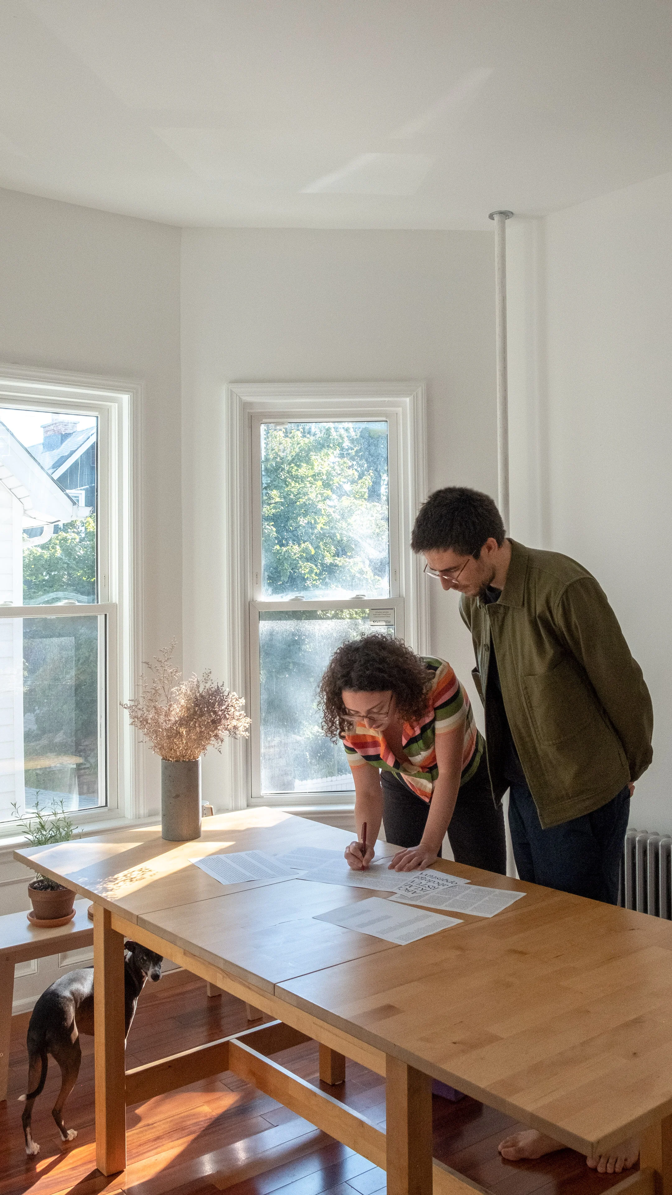
Faire Projects is a Brooklyn-based branding and digital design studio founded by Maxime Gau and Sabrina Nacmias. Below, we chat with them about starting their own studio and a forthcoming type foundry, as well as their deep-seated curiosity and love for type design and typography.
To start, could you tell us a little about yourselves? Where are you from, what you do, and how did you meet?
Sabrina: I’m a graphic and type designer, born and raised in Brooklyn, NY. In 2013 when I was a design student at Pratt Institute, I entered the student competition of the International Poster and Graphic Design Festival of Chaumont, in France. My work did well and I was invited to the festival to see my piece exhibited and to accept 3rd place in the competition. The design festival was a week of workshops and events, and that’s where Maxime and I met.
Maxime: I’m a graphic and type designer from Lyon, France. I grew up in the French countryside between Lyon and Geneva, Switzerland. I studied graphic design in France at ESAD Valence, and when I was finished with my studies, I moved to Brooklyn in 2015 to be with Sabrina and pursue interesting work opportunities in New York. In 2016 we started our graphic design studio, Faire Projects.
Notebook for Smart Wetlands, a non-profit organization focusing on nutrient reduction solution for tiled cropland
Can you tell us about Faire Projects, what prompted the both of you to create the studio, what do you specialize in, and what are your roles in the studio?
Sabrina: Maxime and I had always known we wanted to work together and at some point open our own studio. In 2014, we were both interning in the same studio, and there was a poster in the studio with “FAIR” in huge letters in a classic wood type-style typeface. Maxime at the time was still learning English and he noticed this word and loved that “fair” in English and “faire” in French are pronounced the same, and both have such relevant meanings for a design studio.
Maxime: “Fair” in English means “just” and “honest,” and “faire” in French means “to make” or “to do.” So Faire Projects seemed like a great name for our studio. And so once we had the name, we had to just find the right time in our career to get started.
Between 2015 and 2016, I was in the process of getting a green card, so I wasn’t legally allowed to work at that time. I spent my time learning type design and setting up a common portfolio with Sabrina. I made a Behance and created an email address for Faire Projects. After not having seen my family for almost two years, when I finally got my green card, we went to France for two months. When we came back to New York, we started looking for jobs. After a few weeks I remembered about that email address I had set up. We opened it and there was a job waiting for us, it was big enough to get Faire Projects going.
Sabrina: The project was to make the annual report for a real estate consultancy company called T3 Sixty. They ended up being a great client to work with and we ultimately rebranded them.
Stationery system for real estate consultancy T3 Sixty
Before this project we loved the idea of having a studio, but we didn’t totally understand what it meant. Having our own studio meant we now had to worry about contracts, proposals, invoices and a lot of other things we didn’t need to think about when we were freelancing or working full-time in places. But it also meant a more direct relationship with our clients. It’s very rewarding to help someone advance their business and really understand what they need and how we can help them to connect with their audience, or present their research, or communicate a new idea or product to the world.
Maxime: It also helps that we’ve had really wonderful clients over the years. We’ve worked with a lot of small businesses and organizations, so we do a little bit of everything, but primarily branding and visual identity work, websites, and packaging design. Typography and typographic solutions are what ties all of our work across different mediums together.
We both touch a little bit of everything in the studio. We work in a very collaborative way, always asking for feedback from each other and exchanging design files. For the business side of it I want to give a shout-out to Sabrina; Faire Projects would not exist without her. She handles a lot of the communication with our clients, and we usually work together on making contracts and building proposals and portfolios.
We’d love to learn more about your projects and your design process. Can you speak about a couple of them with us?
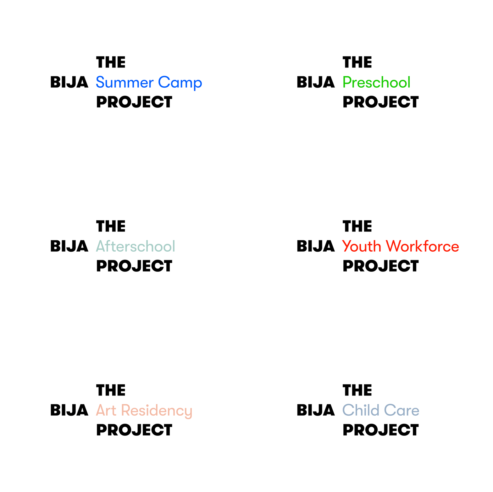
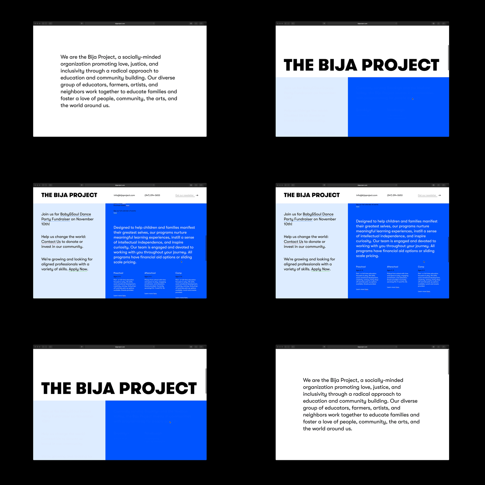
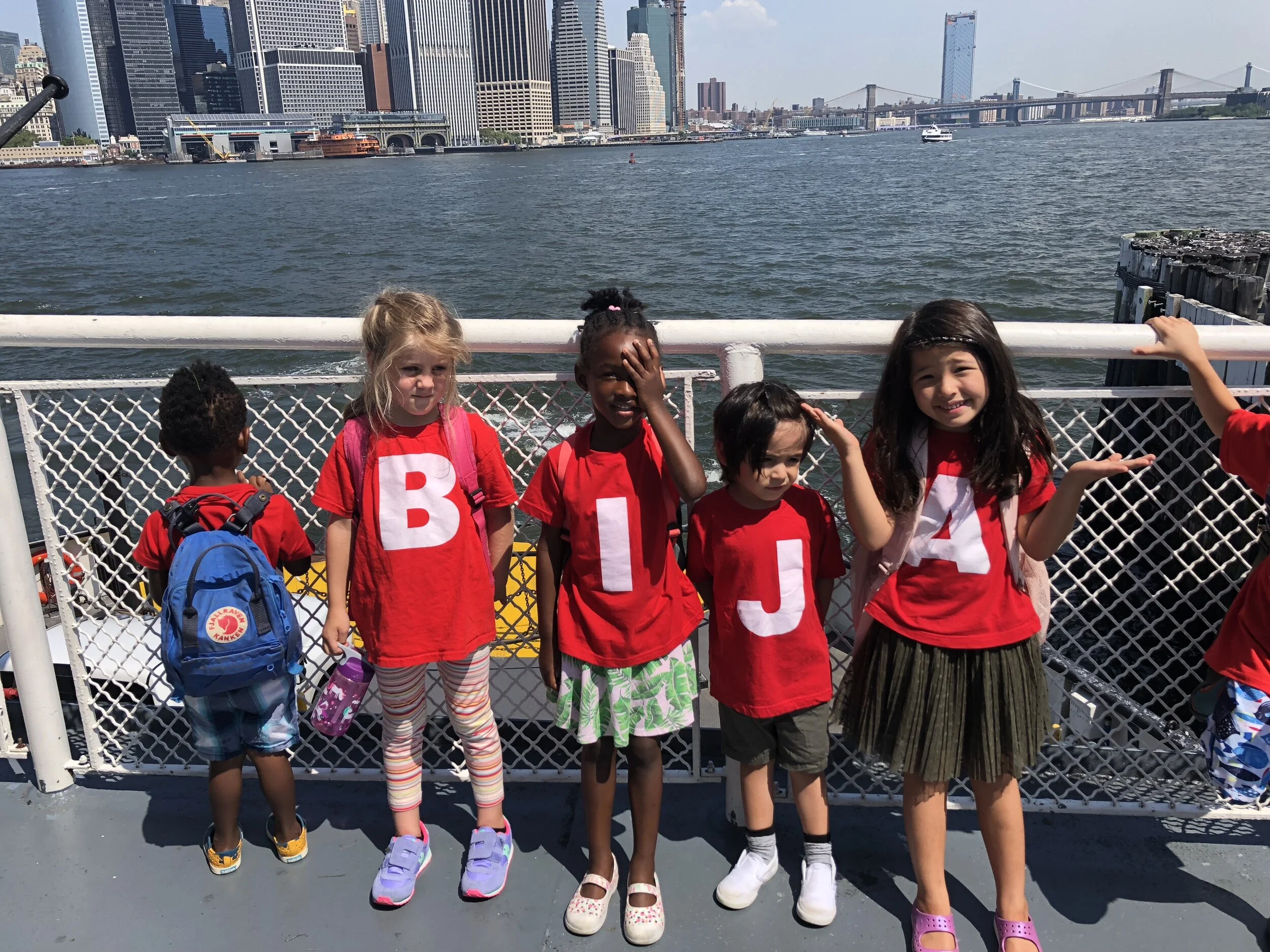
Maxime: Sure! In 2017 we started working with The Bija Project, a local socially-minded organization in Brooklyn promoting love, justice, and inclusivity through a radical approach to education and community building. Previously known as Bija Kids, we worked with them to evolve their name and create a new brand identity and voice to reflect their bold, honest ideas about education and what it means to be a community. Born from the idea that The Bija Project is an ever-changing project, the logo system was designed with space for new activities, services, and ideas so they can continue to grow and evolve—which we have had the pleasure to watch them do over the years. They grow and adapt with their community, and we’re lucky that they trust us to partner with them every time they have something new going on. Most recently we’ve worked with them to adjust their activity to the restrictions due to the pandemic. They’re now doing at home education subscriptions boxes—highly recommend them to anyone homeschooling kids right now. You can check all the great things The Bija Project is doing on their website.






Sabrina: Another wonderful client we’ve worked with is a non-profit organization, Smart Wetlands. They build small farm-based wetlands to naturally reduce nutrient pollution in the Mississippi River system and improve water quality. Our task was to brand Smart Wetlands so their identity and visual communication would speak to high-tech modern farmers. The visual identity was inspired by technical relief maps, and satellite views of croplands and corn plantations.


Maxime: Another project we really love is the identity we built for Selle & Ciel. For this one we worked with my sister, Carole Gau, to build the visual identity for her business. It’s a French association practicing équicie (equine-assisted therapy). She works with horses to accompany mental health and physical health treatments. We worked with her to concept, art direct, name, and build the brand identity of the association. The name is built from selle (the French word for “saddle”), and ciel (the French word for “sky” or “heaven”), implying that while working with the horses and Carole, the patient is grounded in the saddle, with a free and open spirit. In the practice of équicie, the horse is always in the center between the équicien (equine-therapist) and the patient so we drew a custom logotype for this with a horse-shaped ampersand, which like the organization keeps the horse in the position of a mediator.


Sabrina: And we’re currently working on some really fun identity projects that will be launching soon, so follow along on our Instagram @faireprojects for the latest work.
We also know you’re in the process of launching a type foundry Faire Type. Could you tell us more about that? And why the decision to start a type foundry in conjunction with a design studio?
Maxime: Yes, we are starting a type foundry, Faire Type! As you saw we love to find typographic solutions to our graphic design projects, so type design came naturally. We’ve been learning and practicing type by ourselves since we were in design school, and last year Sabrina and I both decided to do the Type@Cooper Extended Program at The Cooper Union—we just graduated the program in August 2020. We’re now working on polishing up typefaces we’ve drawn over the years and getting everything ready for retail release in 2021.
Sabrina: In a way type design is more of an artistic practice than graphic design. The work is usually self-initiated and self-defined. You always have the same brief: the letters and numbers of the alphabet are never going to change too drastically, but there’s a lot of creativity and playfulness that’s possible and that’s really exciting to us.
Do your type projects come out of design projects? Does it work the other way around too?
Sabrina: Yes it totally goes both ways! We recently did a branding exercise for a new savonnerie in France and we were so inspired by the logo we created for them, we had to make it into a typeface. There are a lot of great ideas that come out of branding projects, because they’re usually short bursts of creative energy that explore a wide range of visual territory.
It also works the other way too, for example our friend Baptiste asked us to customize one of our typefaces (Octave) to make a logo for a jewelry brand called Tétier Bijoux.
Which typefaces do you get inquired the most about? And why do you think that is?
Maxime: Well we haven’t officially launched our retail catalogue (you can start to explore on our website, but it’s not possible to shop yet), so the main way people are learning about our typefaces is probably through our Instagram. We’ve received a lot of interest for Palme, Sprig, and Octave. I think it’s because they feel really relevant to the current design zeitgeist even if both Sprig and Octave are revivals.
Could you tell us about some of the typefaces you’ve designed, what was the intention behind creating it, what was the research, and how do you see it being used?
Maxime: Palme is a sans serif typeface that we started in 2018 for Faire Projects materials, like presentations and contracts. It has a quite low x-height and takes inspiration from the work of Roger Excoffon who designed Antique Olive and Paul Renner who designed Futura. For our own brand identity we wanted a typeface that was fun and distinct, but also super versatile so it can work both at small and larger text sizes.


Sabrina: Toast is a typeface I started in the Type at Cooper program. Our brief for the assignment was to create a typeface that distributes weight in the letterforms in the same way a broad nib calligraphy pen would if you were writing the letters by hand. There’s a way to make it subtle, but I decided to lean into the calligraphy pen and emphasize it however I could while still creating a typeface that doesn’t feel decorative or what you’d expect from a calligraphic typeface.
I was inspired by the contrast of the warmth of being hand-made, and the cold, robotic-ness of being constructed on the computer. And that juxtaposition really became the heart of Toast: it’s a typeface with a warm calligraphic structure that has strong references to the broad-nib pen, with a cool, crisp, smooth, geometric appearance.

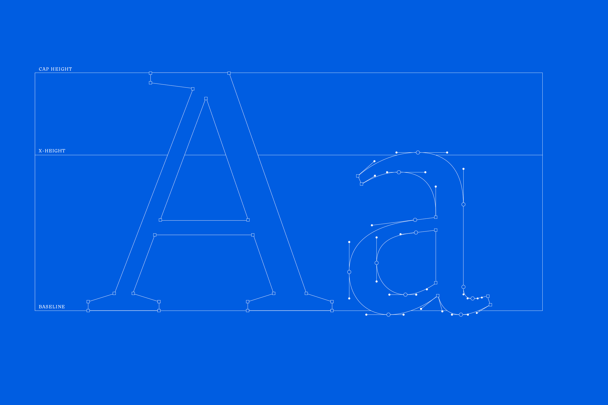

Maxime: Octave is a revival typeface of a design by Théophile Beaudoire (Fonderie Générale) in the late 19th century in France. It’s part of the then-popular Elzévir style, which is interestingly mixing modern and old style characteristics. It is designed to be pleasant to read at text size.


We’re also curious to learn more about the business aspect side. What are the main things to consider and watch out for when you’re selling your typefaces?
Sabrina: Selling type is complicated because you’re actually selling a license to use the typeface—not the typeface itself. So it’s important to have a really solid end user license agreement (EULA). There are also different licenses for different uses of the typeface: for example often there is a license for desktop and print design, and another license for hosting the typeface on the web. While we haven’t yet made our typefaces available for sale online, how we can simply and easily communicate these different licenses and set up our shop to accommodate them will probably be our biggest challenge.
How do you see your design studio and type foundry grow in the next couple years?
Maxime: Right now our main income is from design and most of our normal 9-5 working hours are devoted to client design work. As things progress with the type foundry, we’re hoping to find a better balance between type and graphic design. We’re so excited to launch Faire Type in 2021, it’s been in the works for so many years, and we’re really hoping our typefaces will be well received and designers will be excited and inspired to use them. Follow our journey of building a type foundry at @fairetype and stay tuned for when our retail site launches! You can sign up to our newsletter on our website fairetype.com.
Text and Photography by Maxime Gau and Sabrina Nacmias
Interview by NSC


